Best Neutral Kitchen Cabinet Colors
When it comes to choosing the best neutral kitchen cabinet colors, there are a few timeless options that never go out of style. White cabinets are a popular choice for their clean and bright appearance, making the kitchen feel spacious and inviting. Gray cabinets are another versatile option that can complement a variety of design styles, from modern to traditional. Beige cabinets offer a warm and cozy feel, perfect for creating a welcoming atmosphere in the kitchen. Ultimately, the best neutral kitchen cabinet color is one that suits your personal taste and complements the overall aesthetic of your home.
- White
- Gray
- Beige
- Greige
- Taupe
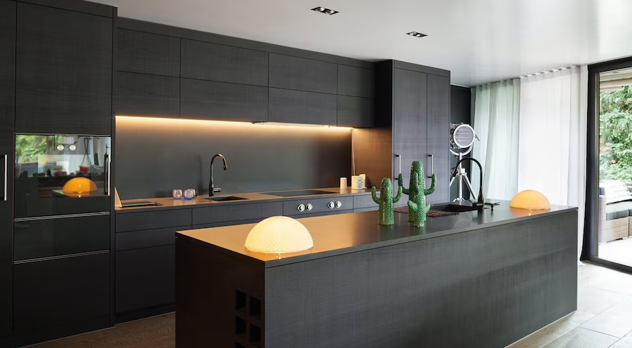
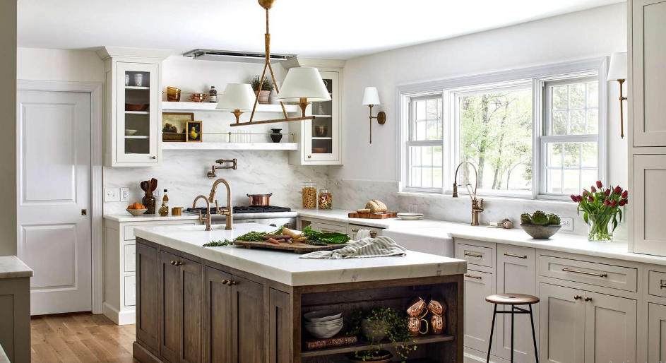
White
White is a color often associated with purity, innocence, and simplicity. It is the color of fresh snow, clean sheets, and pristine wedding dresses. White can evoke feelings of peace and tranquility, as well as a sense of cleanliness and order. In design, white is often used as a neutral backdrop to allow other colors to pop or to create a sense of spaciousness and light. White can also symbolize new beginnings and a blank canvas waiting to be filled with possibilities. Overall, white is a versatile and timeless color that can convey a range of emotions and meanings.
Pros
– Clean and minimalist aesthetic – Versatile and easy to pair with other colors – Creates a sense of space and openness – Can make a room or design feel more modern and sophisticated
Cons
- White can easily show dirt and stains, requiring more frequent cleaning.
- White can be perceived as sterile or cold, lacking warmth and coziness in a space.
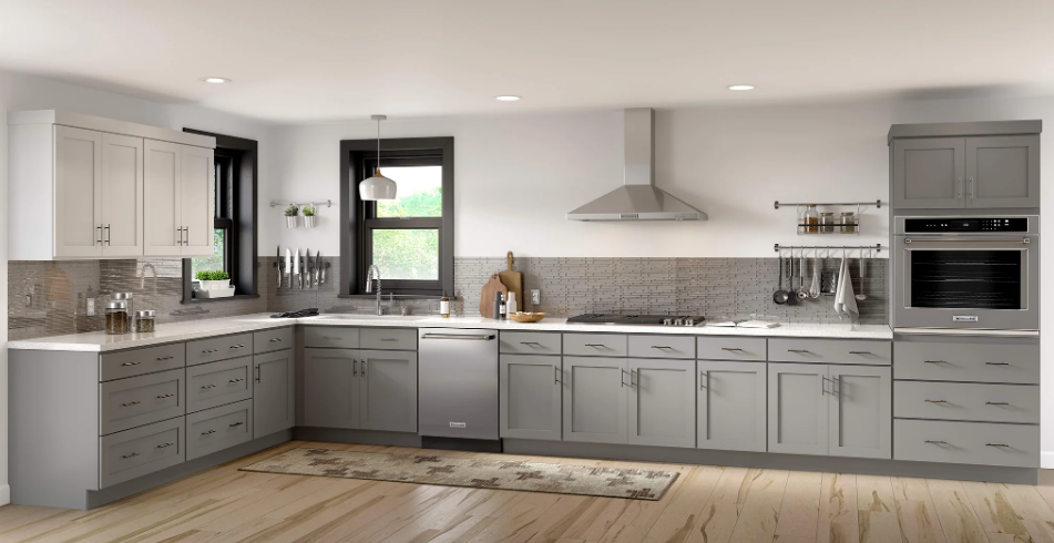
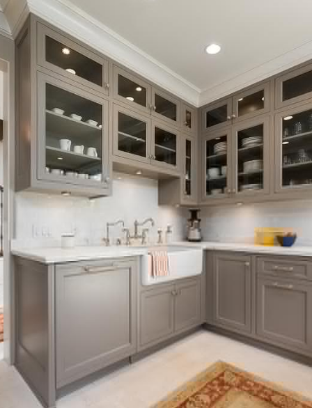
Gray
Gray is a neutral color that falls between black and white on the color spectrum. It is often associated with feelings of balance, stability, and sophistication. Gray can be found in nature, such as in the clouds on a rainy day or the fur of a gray wolf. In interior design, gray is a popular choice for creating a modern and minimalist aesthetic. It can be paired with a variety of other colors to create different moods and atmospheres. Overall, gray is a versatile and timeless color that can be used in many different ways to enhance a space.
Pros
– Gray is a neutral color that can easily complement a wide range of other colors in a design scheme – Gray is a versatile color that can be used in both modern and traditional design styles – Gray can create a calming and soothing atmosphere in a space – Gray can help to create a sense of sophistication and elegance in a design scheme
Cons
- Gray can sometimes be seen as a dull or boring color
- Gray can sometimes evoke feelings of sadness or depression
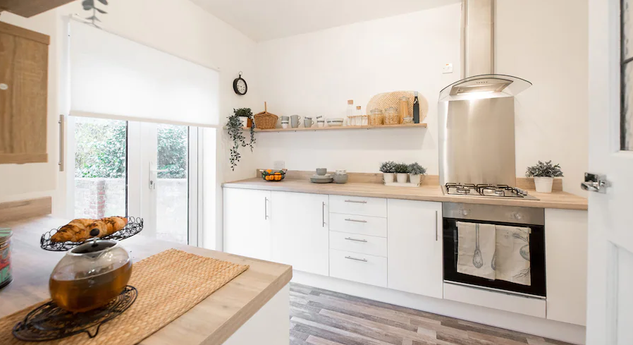
Beige
Beige is a neutral color that is often described as a pale, sandy shade. It is a versatile and timeless color that can be used in a variety of design styles, from modern to traditional. Beige is known for its calming and soothing qualities, making it a popular choice for interior design. It can create a sense of warmth and coziness in a space, while also providing a neutral backdrop for other colors to pop against. Beige is a classic choice for furniture, walls, and accessories, as it can easily blend with a wide range of colors and patterns. Overall, beige is a versatile and elegant color that can add a touch of sophistication to any room.
Pros
- Beige is a versatile and neutral color that can easily complement a variety of other colors and design styles.
- Beige can create a calming and soothing atmosphere, making it a popular choice for bedrooms and living spaces.
- Beige is a timeless color that never goes out of style, making it a safe and reliable choice for home decor.
- Beige can make a space feel larger and more open, as it reflects light and creates a sense of airiness.
Cons
- Can be perceived as boring or dull
- May show dirt or stains more easily
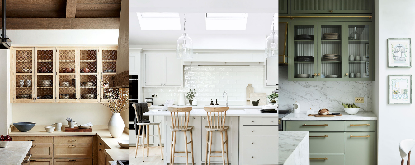
Greige
Greige is a popular color in the world of interior design and fashion. It is a combination of grey and beige, creating a neutral tone that is versatile and timeless. Greige is often used as a base color in home decor, as it pairs well with a variety of other colors and can create a calming and sophisticated atmosphere. In fashion, greige is a popular choice for clothing and accessories, as it is a subtle and elegant color that can be easily dressed up or down. Overall, greige is a classic and chic color that is sure to never go out of style.
Pros
- Greige is a versatile color that can easily complement a variety of design styles and color palettes.
- Greige is a neutral color that can create a calming and soothing atmosphere in a space.
- Greige can help to create a cohesive and harmonious look when used as a base color in a room.
- Greige is a timeless color that won’t go out of style, making it a great choice for long-term design projects.
Cons
- Can appear dull or lackluster in certain lighting
- May not provide enough contrast or visual interest in a space
Taupe
Taupe is a versatile and sophisticated color that falls somewhere between brown and gray on the color spectrum. It is often described as a warm, earthy tone that exudes a sense of elegance and understated beauty. Taupe can be used as a neutral backdrop in interior design, providing a calming and soothing atmosphere in any space. It pairs well with a variety of colors, making it a popular choice for both modern and traditional decor styles. Whether used in clothing, home decor, or accessories, taupe adds a touch of timeless sophistication to any look.
Pros
- Neutral and versatile color that pairs well with a variety of other colors
- Creates a calming and soothing atmosphere in a room
- Works well in both modern and traditional design styles
- Helps to hide dirt and stains, making it a practical choice for high-traffic areas
Cons
- Can appear dull or boring in certain lighting
- May not provide enough contrast in some color schemes
FAQs
What are the differences between white, gray, beige, greige, and taupe in terms of color and how they are used in interior design?
- White: White is a pure and neutral color that can create a clean and fresh look in a space. It can make a room feel larger and brighter. White is often used as a base color in interior design to create a minimalist or modern aesthetic.
- Gray: Gray is a versatile color that can range from cool to warm tones. It is often used as a neutral backdrop in interior design and can create a sophisticated and calming atmosphere. Gray can be paired with a variety of colors to create different moods in a space.
- Beige: Beige is a warm and inviting color that can create a cozy and comfortable feel in a room. It is often used as a neutral color in interior design to add warmth and depth to a space. Beige can be paired with earth tones or bold colors for a more dynamic look.
- Greige: Greige is a combination of gray and beige, creating a versatile and neutral color that can work well with a variety of color schemes. Greige can add warmth and sophistication to a space while still maintaining a modern and clean look. It is a popular choice for interior design as it can easily blend with different styles.
- Taupe: Taupe is a warm and earthy color that can create a cozy and elegant atmosphere in a room. It is a versatile color that can work well with both cool and warm tones. Taupe is often used in interior design to add depth and richness to a space, and it can be paired with a variety of colors to create different moods.
What are the historical and cultural implications of the color white in various societies and religions?
Historical and Cultural Implications of the Color White
In various societies and religions, the color white holds significant historical and cultural implications:
- Western cultures: In Western cultures, white is often associated with purity, innocence, and cleanliness. It is commonly worn by brides on their wedding day as a symbol of purity and new beginnings.
- Eastern cultures: In many Eastern cultures, white is associated with death, mourning, and funerals. It is often worn by mourners and is considered a color of mourning and respect.
- Christianity: In Christianity, white is often associated with light, purity, and holiness. It is commonly used in religious ceremonies such as baptisms and weddings to symbolize purity and new life.
- Buddhism: In Buddhism, white is associated with purity, simplicity, and enlightenment. It is often used in religious ceremonies and rituals to symbolize spiritual purity and enlightenment.
- Hinduism: In Hinduism, white is associated with purity, peace, and spirituality. It is often worn by priests and used in religious ceremonies to symbolize purity and divine presence.
What are the benefits of using greige fabric in the textile industry?
- Greige fabric is versatile and can be dyed or printed in a variety of colors and patterns.
- It is cost-effective as it eliminates the need for additional processing steps such as bleaching.
- Greige fabric is more environmentally friendly as it requires less water and chemicals during production.
- It has a natural look and feel, making it popular for a wide range of textile applications.
What are the psychological effects of living in a gray environment for an extended period of time?
Living in a gray environment for an extended period of time can have several psychological effects:
- Feelings of sadness and depression
- Lack of motivation and energy
- Increased stress and anxiety
- Difficulty concentrating and focusing
- Decreased creativity and inspiration
What are the common characteristics and uses of beige in interior design?
Common Characteristics of Beige in Interior Design:
- Neutral color that pairs well with a variety of other colors
- Creates a warm and inviting atmosphere
- Helps to make a space feel larger and more open
- Works well in both traditional and modern design styles
Uses of Beige in Interior Design:
- Wall color to create a calming backdrop for other decor
- Upholstery and furniture to add a sense of comfort and coziness
- Accent pieces such as rugs, pillows, and curtains to tie a room together
- Can be used in combination with bolder colors for a more balanced look
What are some popular color combinations that pair well with taupe in interior design?
- Gray and taupe
- Navy and taupe
- Blush pink and taupe
- Mint green and taupe
- Mustard yellow and taupe